UX STRATEGY
UX STRATEGY
⋅
FIELD WORKFORCE PLATFORM
FIELD WORKFORCE PLATFORM
Designing for the person doing the work, not just watching it
Designing for the person doing the work, not just watching it
A discontinued field-workforce platform was being relaunched with AI. Every competitor had built for the manager's view. I proposed something different and designed proof-of-concept screens to show it.
A discontinued field-workforce platform was being relaunched with AI. Every competitor had built for the manager's view. I proposed something different and designed proof-of-concept screens to show it.
ROLE
UI/UX Designer
SCOPE
Strategy + POC Screens
TIMELINE
1 weeks
STATUS
Taken to the Next Phase

Note:
Note:
Client and product details have been anonymised per confidentiality requirements. Names, locations, and identifying information in the screens have been replaced with fictional equivalents
Client and product details have been anonymised per confidentiality requirements. Names, locations, and identifying information in the screens have been replaced with fictional equivalents

Background
Background
The Brief
The Brief
A B2B field-workforce platform used by companies to manage field workers wanted to bring their product back to market. The company had built a version of this years earlier, but it had been discontinued and left dormant. The goal was to relaunch it with A.I. as a meaningful differentiator rather than simply picking up where the old product left off. My role: take this open brief, land on a direction, and produce proof-of-concept (POC) screens to show the client what that direction could feel like in a week.
A B2B field-workforce platform used by companies to manage field workers wanted to bring their product back to market. The company had built a version of this years earlier, but it had been discontinued and left dormant. The goal was to relaunch it with A.I. as a meaningful differentiator rather than simply picking up where the old product left off. My role: take this open brief, land on a direction, and produce proof-of-concept (POC) screens to show the client what that direction could feel like in a week.
A B2B field-workforce platform used by companies to manage field workers wanted to bring their product back to market. The company had built a version of this years earlier, but it had been discontinued and left dormant. The goal was to relaunch it with A.I. as a meaningful differentiator rather than simply picking up where the old product left off. My role: take this open brief, land on a direction, and produce proof-of-concept (POC) screens to show the client what that direction could feel like in a week.
The Brief:
Define a direction for AI integration into the existing app and make it visual. Show the concept, not a finished product.
Define a direction for AI integration into the existing app and make it visual. Show the concept, not a finished product.
Field-workforce management is a crowded space. GPS tracking, geofenced attendance, activity logs, and dashboards are already standard, and adding AI alone wouldn't solve much. The real question was: what are these products still failing to do for the people actually doing the work?
Field-workforce management is a crowded space. GPS tracking, geofenced attendance, activity logs, and dashboards are already standard, and adding AI alone wouldn't solve much. The real question was: what are these products still failing to do for the people actually doing the work?
Field-workforce management is a crowded space. GPS tracking, geofenced attendance, activity logs, and dashboards are already standard, and adding AI alone wouldn't solve much. The real question was: what are these products still failing to do for the people actually doing the work?
RESEARCH
RESEARCH
Reading the Competitive Landscape
Reading the Competitive Landscape
I reviewed eight field workforce platforms, four from India and four global, using product websites, app listings, and publicly available feature information. With only a week available, the research was limited to desk research. The goal was to understand what these products commonly offer and, more importantly, where they fall short. Here’s what I found:
I reviewed eight field workforce platforms, four from India and four global, using product websites, app listings, and publicly available feature information. With only a week available, the research was limited to desk research. The goal was to understand what these products commonly offer and, more importantly, where they fall short. Here’s what I found:
I reviewed eight field workforce platforms, four from India and four global, using product websites, app listings, and publicly available feature information. With only a week available, the research was limited to desk research. The goal was to understand what these products commonly offer and, more importantly, where they fall short. Here’s what I found:

No matter how advanced the feature set was, every product approached the problem from the same perspective: a manager overseeing the workforce. The worker experience felt secondary, mainly focused on checking in, logging tasks, and sharing updates. The gap was in the perspective rather than feature.
No matter how advanced the feature set was, every product approached the problem from the same perspective: a manager overseeing the workforce. The worker experience felt secondary, mainly focused on checking in, logging tasks, and sharing updates. The gap was in the perspective rather than feature.
No matter how advanced the feature set was, every product approached the problem from the same perspective: a manager overseeing the workforce. The worker experience felt secondary, mainly focused on checking in, logging tasks, and sharing updates. The gap was in the perspective rather than feature.
Design Direction
Design Direction
Reframing the Product's Purpose
Every product I'd reviewed answered some version of:
Every product I'd reviewed answered some version of:
Every product I'd reviewed answered some version of:
Is this employee where they should be, doing what they should be doing?
The obvious response would have been to improve the manager-side experience further — smarter dashboards, richer analytics. But those would still optimise the view from above. The more interesting question was what the product could do differently for the person on the ground.
The obvious response would have been to improve the manager-side experience further — smarter dashboards, richer analytics. But those would still optimise the view from above. The more interesting question was what the product could do differently for the person on the ground.
The obvious response would have been to improve the manager-side experience further — smarter dashboards, richer analytics. But those would still optimise the view from above. The more interesting question was what the product could do differently for the person on the ground.
I proposed shifting the product's relationship with field workers from something that primarily monitors them to something that actively helps them through their day. Not at the expense of business accountability, but in support of it. If workers find the app genuinely useful, they're more likely to engage with it consistently and accurately, which in turn leads to better operational data for the organization. The two goals support each other.
I proposed shifting the product's relationship with field workers from something that primarily monitors them to something that actively helps them through their day. Not at the expense of business accountability, but in support of it. If workers find the app genuinely useful, they're more likely to engage with it consistently and accurately, which in turn leads to better operational data for the organization. The two goals support each other.
I proposed shifting the product's relationship with field workers from something that primarily monitors them to something that actively helps them through their day. Not at the expense of business accountability, but in support of it. If workers find the app genuinely useful, they're more likely to engage with it consistently and accurately, which in turn leads to better operational data for the organization. The two goals support each other.
UX STRATEGY
UX STRATEGY
Designing for the Shift, Not Just the User
Designing for the Shift, Not Just the User
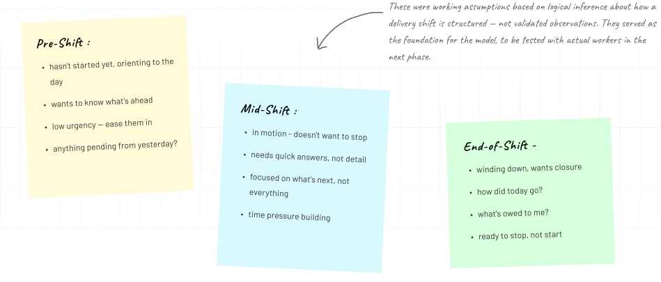
A field worker's day isn't flat. Pre-shift, mid-shift, and end-of-shift are genuinely different moments with different needs, different pressure levels, different information priorities. Most field-ops apps present the same interface regardless. I used the delivery partner persona as the test case for this model, anchoring what's an abstract principle to a real role with a clear shift structure.
A field worker's day isn't flat. Pre-shift, mid-shift, and end-of-shift are genuinely different moments with different needs, different pressure levels, different information priorities. Most field-ops apps present the same interface regardless. I used the delivery partner persona as the test case for this model, anchoring what's an abstract principle to a real role with a clear shift structure.
A field worker's day isn't flat. Pre-shift, mid-shift, and end-of-shift are genuinely different moments with different needs, different pressure levels, different information priorities. Most field-ops apps present the same interface regardless. I used the delivery partner persona as the test case for this model, anchoring what's an abstract principle to a real role with a clear shift structure.

Proof of Concept
Proof of Concept
The Screens
The Screens
Three screens, each representing a different shift state, were created to demonstrate the tone, information hierarchy, and productivity-first approach. They were presented alongside the strategic rationale as a concept package for the client to evaluate the direction, not as finished UI.
Three screens, each representing a different shift state, were created to demonstrate the tone, information hierarchy, and productivity-first approach. They were presented alongside the strategic rationale as a concept package for the client to evaluate the direction, not as finished UI.
Three screens, each representing a different shift state, were created to demonstrate the tone, information hierarchy, and productivity-first approach. They were presented alongside the strategic rationale as a concept package for the client to evaluate the direction, not as finished UI.
Pre-Shift — Before the Day Starts
Pre-Shift — Before the Day Starts
Pre-Shift — Before the Day Starts
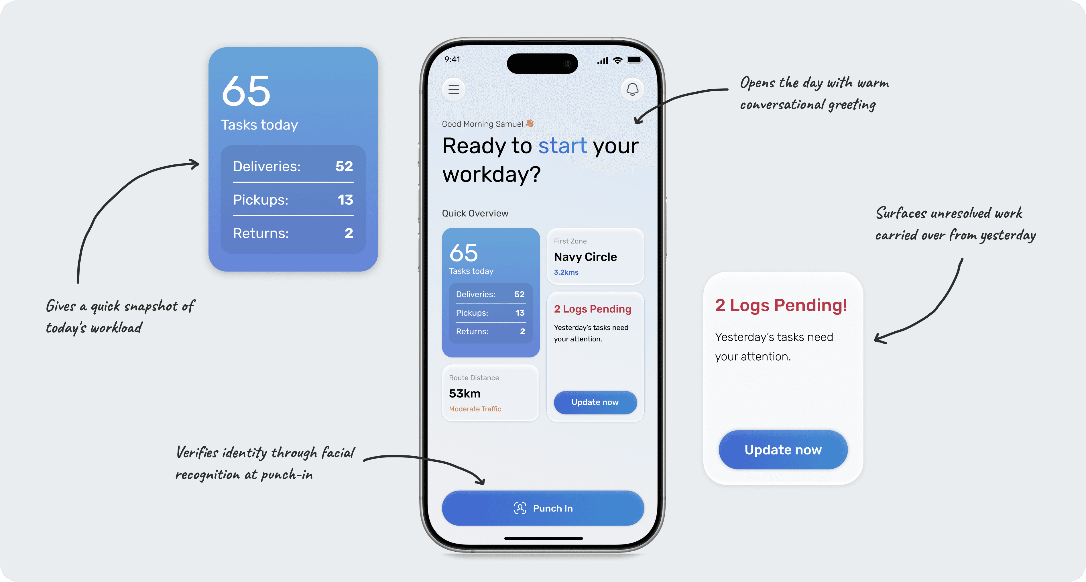
Before clocking in, the worker sees their task count for the day, their first stop, and any pending items carried over from the previous day. The copy is intentionally conversational, making the app feel proactive rather than purely transactional. Facial recognition for attendance verification sits behind the punch-in action, meeting the client's requirement for identity confirmation at the start of a shift.
Before clocking in, the worker sees their task count for the day, their first stop, and any pending items carried over from the previous day. The copy is intentionally conversational, making the app feel proactive rather than purely transactional. Facial recognition for attendance verification sits behind the punch-in action, meeting the client's requirement for identity confirmation at the start of a shift.
Before clocking in, the worker sees their task count for the day, their first stop, and any pending items carried over from the previous day. The copy is intentionally conversational, making the app feel proactive rather than purely transactional. Facial recognition for attendance verification sits behind the punch-in action, meeting the client's requirement for identity confirmation at the start of a shift.
Mid-Shift — In the Middle of the Day
Mid-Shift — In the Middle of the Day
Mid-Shift — In the Middle of the Day
The headline presents remaining stops as a countdown, applying the same motivation principle as a progress bar. The current task is prioritized with key information visible at a glance. A persistent AI assistant can provides task and shift updates eliminating the need to navigate elsewhere in the app.
The headline presents remaining stops as a countdown, applying the same motivation principle as a progress bar. The current task is prioritized with key information visible at a glance. A persistent AI assistant can provides task and shift updates eliminating the need to navigate elsewhere in the app.
The headline presents remaining stops as a countdown, applying the same motivation principle as a progress bar. The current task is prioritized with key information visible at a glance. A persistent AI assistant can provides task and shift updates eliminating the need to navigate elsewhere in the app.

End-of-Shift — When the Day Wraps Up
End-of-Shift — When the Day Wraps Up
End-of-Shift — When the Day Wraps Up
Once the shift is complete, the focus shifts from action to summary: completed tasks, overtime, distance covered, and compensation earned. A weekly performance view provides broader weekly context. The deliveries card provides a final tally, with exceptions like postponed deliveries called out.
Once the shift is complete, the focus shifts from action to summary: completed tasks, overtime, distance covered, and compensation earned. A weekly performance view provides broader weekly context. The deliveries card provides a final tally, with exceptions like postponed deliveries called out.
Once the shift is complete, the focus shifts from action to summary: completed tasks, overtime, distance covered, and compensation earned. A weekly performance view provides broader weekly context. The deliveries card provides a final tally, with exceptions like postponed deliveries called out.

Design Considerations
Design Considerations
The Leaderboard Question
The Leaderboard Question
During discussions with the client, the idea of introducing a leaderboard came up as a way to make performance more visible, encourage friendly competition, and motivate workers. Before including it in the POC, I wanted to assess whether it aligned with the direction the product was already heading.
During discussions with the client, the idea of introducing a leaderboard came up as a way to make performance more visible, encourage friendly competition, and motivate workers. Before including it in the POC, I wanted to assess whether it aligned with the direction the product was already heading.
During discussions with the client, the idea of introducing a leaderboard came up as a way to make performance more visible, encourage friendly competition, and motivate workers. Before including it in the POC, I wanted to assess whether it aligned with the direction the product was already heading.

The second scenario sits in direct tension with the productivity first principle the concept is built on. A tool designed to support workers through their day should not be the same tool that discourages them at the end of it. As a result, the leaderboard was left out of the final POC. If revisited in a later phase, it would need to focus on personal progress rather than peer comparison before earning a place in the product.
The second scenario sits in direct tension with the productivity first principle the concept is built on. A tool designed to support workers through their day should not be the same tool that discourages them at the end of it. As a result, the leaderboard was left out of the final POC. If revisited in a later phase, it would need to focus on personal progress rather than peer comparison before earning a place in the product.
The second scenario sits in direct tension with the productivity first principle the concept is built on. A tool designed to support workers through their day should not be the same tool that discourages them at the end of it. As a result, the leaderboard was left out of the final POC. If revisited in a later phase, it would need to focus on personal progress rather than peer comparison before earning a place in the product.
Next Steps
Next Steps
What the Next Phase Requires
What the Next Phase Requires
The strategic direction, feature framework, and UX principles from this POC carried forward into the next phase (Phase 1) of development. As is common with proof of concept work, the visual design continued to evolve through later iterations. The POC defined what the product should stand for, not what the final UI should look like.
The strategic direction, feature framework, and UX principles from this POC carried forward into the next phase (Phase 1) of development. As is common with proof of concept work, the visual design continued to evolve through later iterations. The POC defined what the product should stand for, not what the final UI should look like.
The strategic direction, feature framework, and UX principles from this POC carried forward into the next phase (Phase 1) of development. As is common with proof of concept work, the visual design continued to evolve through later iterations. The POC defined what the product should stand for, not what the final UI should look like.
The design was hypothesis driven throughout, based on competitive research and informed assumptions rather than direct validation with workers. The next phase would focus on testing those assumptions and identifying what holds up in practice.
The design was hypothesis driven throughout, based on competitive research and informed assumptions rather than direct validation with workers. The next phase would focus on testing those assumptions and identifying what holds up in practice.
The design was hypothesis driven throughout, based on competitive research and informed assumptions rather than direct validation with workers. The next phase would focus on testing those assumptions and identifying what holds up in practice.

The longer-term direction — AI that adapts not just to shift stage but to workload, pace, and proximity to targets — remains the bigger idea this POC was trying to make a case for. The next step is narrowing from hypothesis to evidence.
The longer-term direction — AI that adapts not just to shift stage but to workload, pace, and proximity to targets — remains the bigger idea this POC was trying to make a case for. The next step is narrowing from hypothesis to evidence.
The longer-term direction — AI that adapts not just to shift stage but to workload, pace, and proximity to targets — remains the bigger idea this POC was trying to make a case for. The next step is narrowing from hypothesis to evidence.